
Understanding the Term Mobile SEO Optimization?
What is Mobile SEO Optimization?
Mobile SEO Optimization is a process where smart devices visitors find a specific website/webpage with well optimized and mobile friendly GUI (Graphical User Interface).
In other words, a website may be said mobile-optimized if that user feels comfortable while using a specific webpage without any trouble.
Mobile SEO Optimization is more concerned with the site structure, elegant design, website/page speed, and many other factors that favor the website certainty.
This is the world of Technology, no doubt, and the invention of the computer and the internet has made this world a Global Village. The mini shape in terms of smart devices e.g. mobile phones, tablets, iPads, and other numerous devices have quick access to the material/websites on the internet.
Now, the Total No. of Mobile Users in the world is 5.20 billion and its number is increasing with the passage of time, its number is expected to reach at least 5 billion.
According to Net Craft, from 1991 to 2014, there are 1 billion websites in the world and also there are more mobile internet users than desktop internet users. Globally, 52.7% of users access the internet via Mobile, and 4 out of 5 consumers use smartphones to shop.
The above facts reflect the importance of Mobile and its usage in the internet industry. When we talk about the internet then we obviously are more concerned with the websites. Due to the fast-growing searches on mobile phones or other smart devices, the search engines especially Google have given much importance and extra SEO scores to those sites which are mobile responsive or mobile-friendly.
Mobile SEO Best Practices
If your website is already to search engine friendly then still there is some additional work to do to make your website Mobile Friendly. If your website/blog is not well optimized then read the article Complete SEO Guide and start On-Page SEO Optimization.
Google and the other Search Engines have started favoring smartphones-friendly websites above those which make mobile browsing difficult.
Mobile SEO Optimization Factors:
Well here are some necessary factors or guidelines by Google and other top search engines to keep in mind while optimizing your website for Mobiles and other Smart Devices.
Page speed
The very first Mobile SEO factor is the page speed of your website. The faster pages rank higher, produce maximum conversions, and leave an appealing as well as user returning effect.
Page Speed can be referred to as Page Load Time; “it is the total time in which your webpage content is fully displayed”.
Page Speed is much considered on mobile devices as compared to desktop users because of hardware and connectivity issues. To achieve the page speed milestone according to the search engine guidelines you have to optimize images, minify javascript, CSS and reduce redirects, etc.
Google has clearly declared that better site speed is an indication of being shown in its search results. As Google is measuring the page load time from the first byte but it doesn’t mean that slower websites are not shown in the search result, these are also indexed but indexed with fewer pages within the search engine crawling budget limit which pours a negative effect on your indexation.
Because a webpage with a longer load time will produce a higher bounce rate and a lower average time on page. Also, a business webpage will have to face a minimum conversion rate.
How to Increase Page Load Time?
Here are some considerations for decreasing the page load time for making a website Mobile SEO Friendly.
Enable compression OR Minify HTML, CSS, and JavaScript
Always use compressed files of HTML, CSS, and JavaScript if their size is more than 150 bytes. There are many tools available online that allow CSS, HTML, and JavaScript file compression. Optimize your website code by eliminating unnecessary characters like extra spaces, commas, dashes, code comments, formatting and useless code, etc.
Here are some page speed diagnostic tools recommended by Google.
Minifying HTML OR HTML Code Compressor Tools
- Gzip Free
- Compress HTML Free
- HTML Compressor Free
Minifying CSS OR CSS Compressor Tools
- YUI Compressor Free: can be used to compress both CSS and JavaScript.
- CSSMinifier Free
- Minify Free
- Refresh-sf Free
- CSS Compressor Free
Minify JavaScript – Tools
- JSMin Free
- Packer Free
- Dojo ShrinkSafe Free
Stay away from compressing the images in Gzip rather than using Adobe Photoshop or other tools to compress the image sizes so that you may retain the quality according to the user interactivity.
Some Other Useful Page Speed Diagnostic Tools
- Firebug: Firebug is used by the developers to analyze the webpage performance in Mozilla Firefox.
- Moz Crawl Test: Use this tool to decrease unnecessary redirects.
- PageSpeed: Install this extension for both Firefox and Google Chrome to know the causes behind slowing down your website.
- WebPageTest.org: This tool will provide you with a detailed report on your webpage’s overall performance
Avoid URL Redirects
Another Mobile SEO factor is to avoid URL redirections.
Each time a page redirects to another page, your visitor faces additional time waiting for the HTTP request-response cycle to complete. For example, if your mobile redirect pattern looks like this: “example.com -> www.example.com -> m.example.com -> m.example.com/home,” each of those two additional redirects makes your page load slower.
For example, if your laptop or other device has to face a pattern like thefanmanshow.com -> www. thefanmanshow.com -> m. thefanmanshow.com -> m. thefanmanshow.com/home, then each of the two extra redirects will load a page slower than the original and single URL usage.
Leverage Browser Caching
It is the third and most important Mobile SEO factor. When a specific webpage is searched in browsers like Google Chrome, Mozilla Firefox, Safari, and many others, they cache the images, JavaScript, and associated stylesheets HTML and a lot of other information. When users/visitors try to access the same URL again, then the Browser does not reload the entire page rather it delivers the cached page in order to reduce the page load time.
The YSlow tool is used to check whether your webpage is cache enabled or is been set for the cache expiration date. This tool is used in conjunction with Firebug.
Also set an expiry date for your header to be shown for a specific period of time. Usually, the trend is to expire the header within one year and then renew but if you have a website with a dynamic header then set your header expiry date so that each time the user login to your webpage he/she must have the latest view. Read more about what Google suggests for leveraging browser caching here
Improve Server Response Time
Server response time is directly proportional to your page load time i.e. the faster server serves the better the page load time. The server response time is affected by the total traffic accessing a specific webpage + resources consumed by the webpage + the hosting solution + the software used by the server. All these must be efficiently developed, e.g. minimum resource usage by the webpage, fast serving time, and fast routing to the queries by the server can not only increase the page load time but also create user interactivity and the decreasing bounce rate for that page. The optimal server response time should be no more than 200ms.
Use CDN Instead of Relying on a Single Server
CDNs stand for Content Distribution Networks and are called content delivery networks. Today, storage is fastly moving towards the Data Centers. While data centers are the storage networks where you can store and retrieve a huge amount of data anytime. So, the CDNs are the network server that is used to store multiple copies of your website in various geographical areas and are fast serving whenever a retrieval/serving request is made by the end-users. Storing data to various data centers or the CDNs save a lot of serving time because the user will be served his required information stored on your website from the nearer server. So, storing a website on CDNs will not only decrease the page load time but also decrease the bounce rate of your webpage.
Use Well Optimize images with a Single CSS File
- Use proper image sizes according to the need and the screen resolution.
- Use JPEGs for photographs but exported as web legacy
- Use PNGs (16 colors) for general graphics used on the web
- Do not use inline CSS
- Make sure to use a single CSS file for the entire web page template
- Try to use CSS Sprites which will create a template for all of your frequently used images, for example, social icons, website header, logo, etc. CSS Sprites will combine all images into one single template which will save a lot of time when loading because fewer HTTP requests will be made.
Top 5 Best Mobile-Friendly Test Tools
Making your website Mobile-Friendly is actually pleasing mobile users. So don’t allow Google or other search engines to wipe out your website blog from its mobile search results.
The article contains a list of tools to check whether your website/webpage is mobile-friendly or not or near. Also, the web engineer can find the optimum methods on what fixation should be done to properly optimize and how!
1. Google’s Mobile-Friendly Test
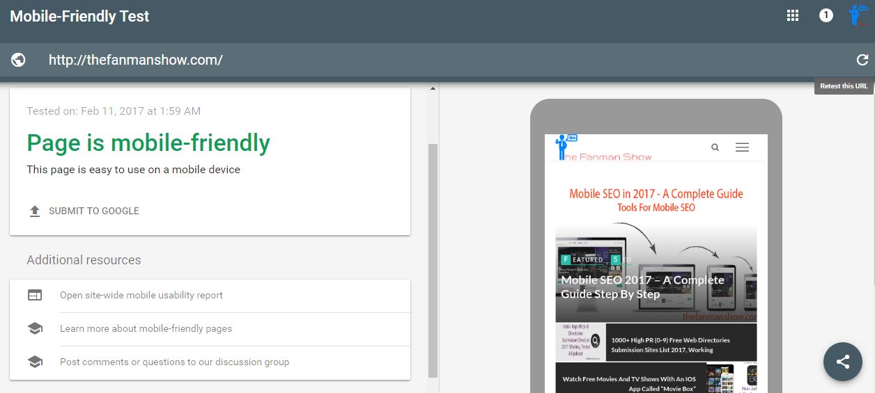
Millions of web developers choose Google Mobile-Friendly Tool to test their website anonymously for user’s behavior. The vital point here to mention is that more than 95% of websites are made according to the instructions prescribed by the Google Web Master Tool, here also you can find how the Google Bot considers your website and the necessary instructions to optimize your webpage for making better on-site SEO, better user behavior and optimum visibility in search results.
Once your website has passed the Google Mobile-Friendly test, you will find a green signal saying:
- “Awesome! This page is mobile-friendly”
If it failed, you will see a red alert
- “Not mobile-friendly”
In case of failing the mobile test, it also displays the causes of failure too as fonts are too small, content is wider than a screen, buttons are smaller or closer links, etc.
2. Google’s PageSpeed Insights

Another highly appreciated and handy tool for testing mobile websites by Google is PageSpeed Insights by Google, used by plenty of web developers to test the page speed and tells the complete and incomplete aspects of a website as an analysis.
Analyzing your website in Pagespeed Insights shows you:
- A Mobile and Desktop view of your website with screenshots.
- Website page speed score of both Mobile and Desktop
- Plenty of necessary detailed information on what you should fix or what is already optimized and what you should consider further for optimization.
3. Keynote MITE

One of the most used mobile website testing tools is “Keynote Mobile Internet Testing Environment (MITE)”. It not only helps in analyzing your webpage but also provides the technique and methods to optimize it correctly.
It’s not an emulator but a user agent that has more than 2100 supported products. The process involves very simple steps just browse the URL, choose the device in which you want to see a particular view, the Keynote MITE will show you how the page looks like in that hardware along with the detailed report on:
- Mobile-friendly content
- Design
- Page performance
- Mobile Experience
There are numerous functions of the Keynote MITE but you can not beat the price as well.
4. BrowserStack
BrowserStack is a paid service that allows you detailed screenshots of your website view on various devices. It sometimes becomes slow, because it continues to load the website each time on a standalone device and presents a screenshot.
5. W3C’s MobileOK Checker
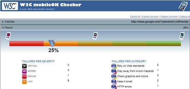
The last one is W3C’s MobileOK Checker, an old-fashioned outdated look but still, an awesome tool to get the test successfully done.
W3C’s MobileOK Checker checks the:
- website’s markup code errors
- graphics or image errors
- HTTP errors
- Resource sizes error
- SSL Certificate validity
Final Words
In the end, we have discussed many important mobile SEO factors and the Best Mobile-Friendly Test Tools. if you use these tools and Mobile SEO factors on your blog or website there will be certain successful results. And your website or blog will become speedy, mobile-friendly, and totally responsive.
If you find this article helpful for you, don’t hesitate to share your experience with us via the comments section.